Perfecting White Balance: Get True-to-Life Colors in Every Shot
Hi there — I’m an enthusiast photographer and I want to share with you how I learn how to adjust white balance for natural and accurate color tones in my shots. If you’ve ever taken a photo and wondered why the skin tones looked off, or the snow looked blue or yellow, then this is for you. Let’s dive in and get your colours back on track.
Why White Balance Matters
Have you ever taken a picture indoors and noticed everything looks too orange? Or you shot a scene in shade and it suddenly felt icy blue? That’s the colour-cast at work. Our eyes are brilliant at adapting and making white things look white in all kinds of light — but cameras don’t automatically do that perfectly.
By getting white balance right, you make your photos look the way you remember them — the way your eyes saw them. That means more natural skin tones, accurate colours and fewer “why does this look so weird” moments.
What is White Balance?
In plain English — white balance is your camera (or you) telling the camera “this is what white really is in this scene”. Once that base is set, all other colours fall in line.
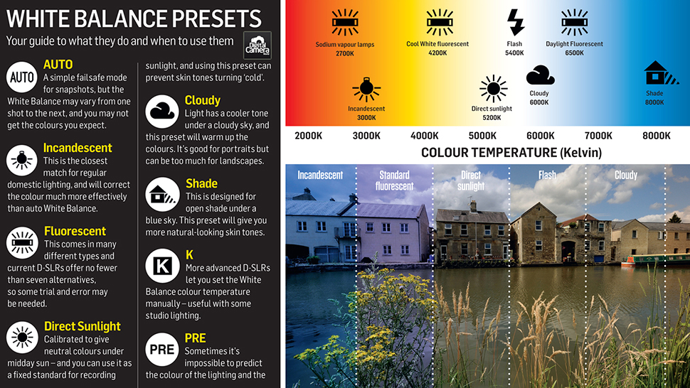
The role of colour temperature
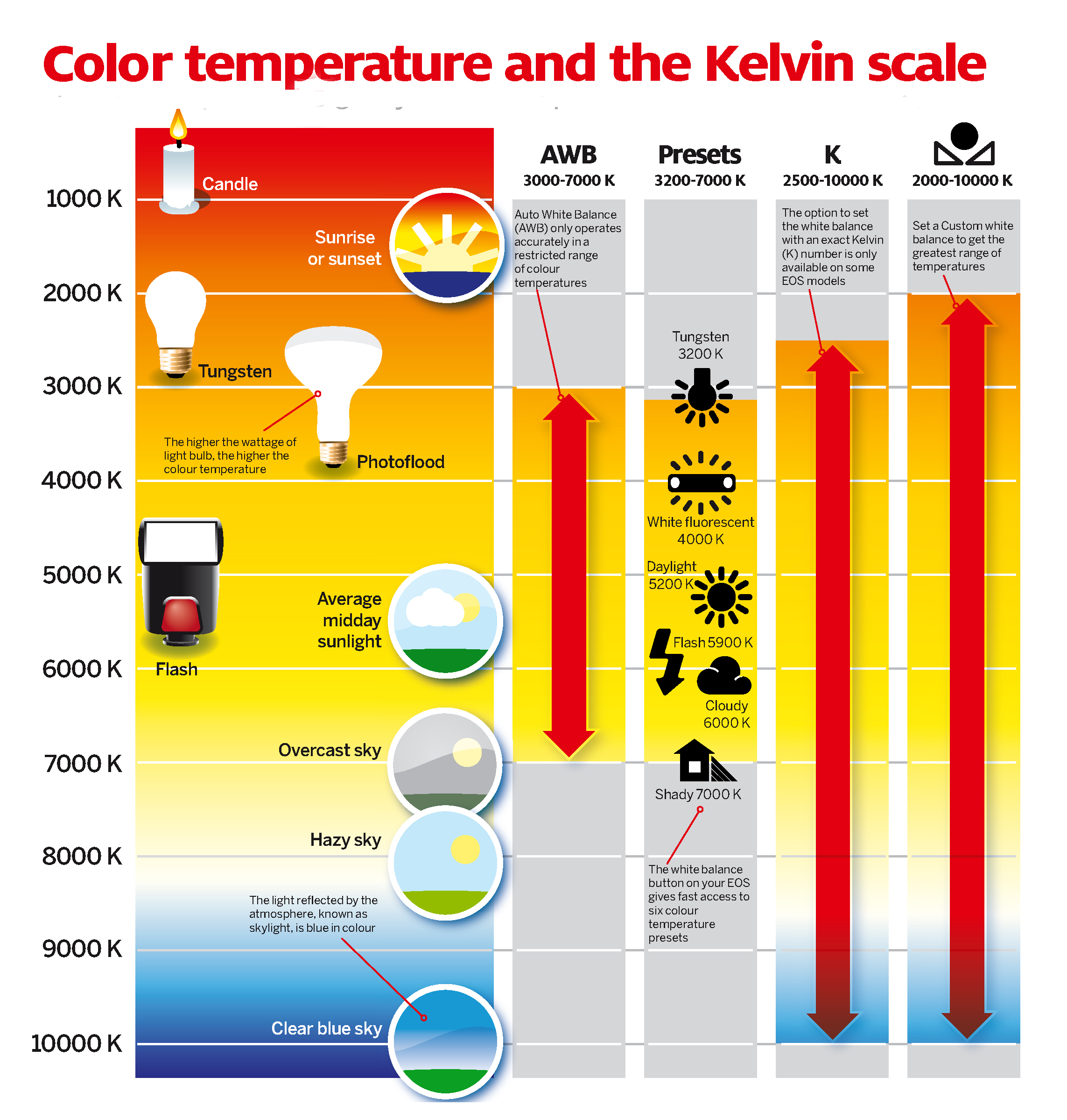
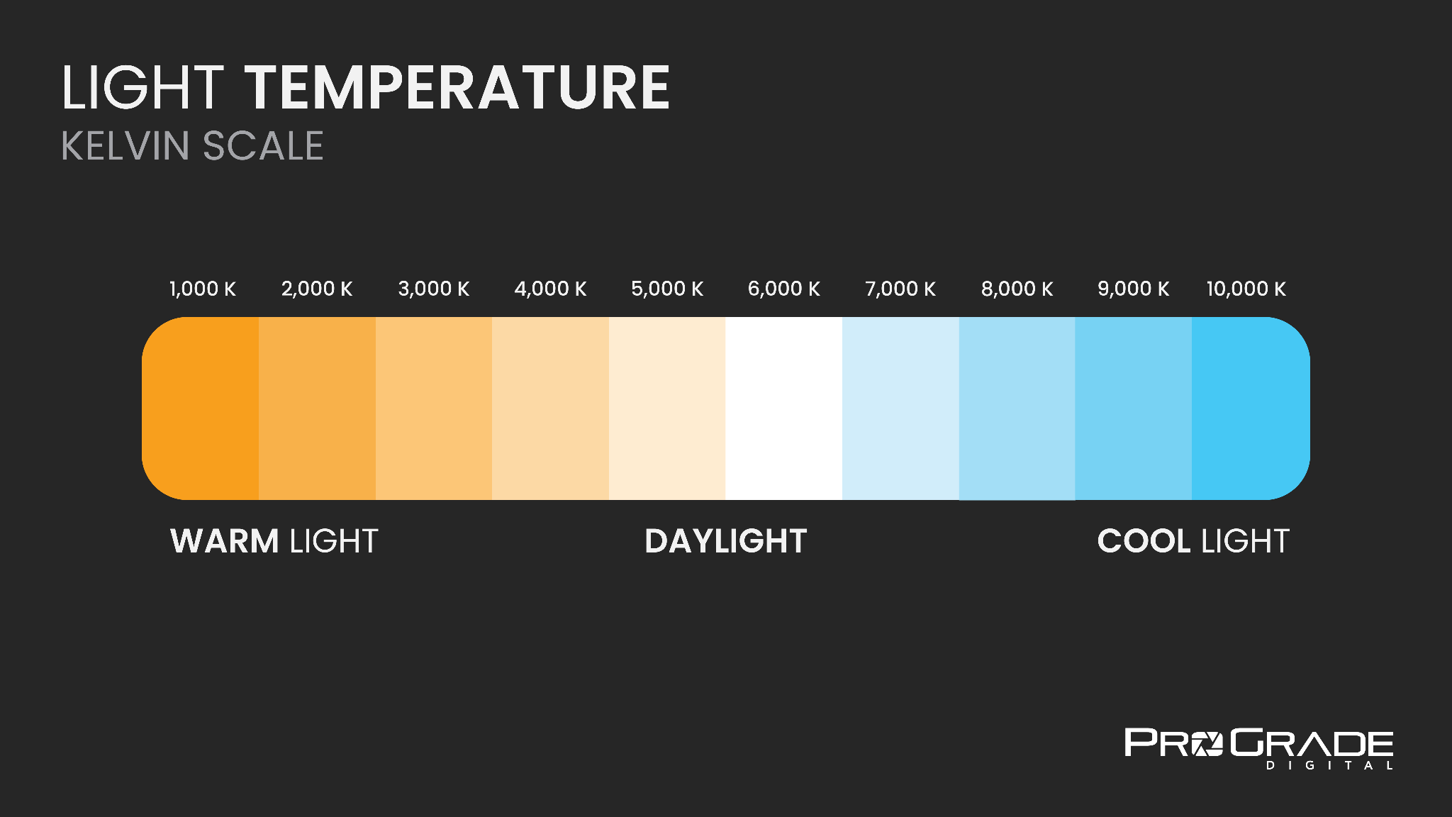
Light has a “temperature” measured in Kelvins (K). It’s not about hot or cold in the everyday sense — it’s about how bluish or orangey the light is. For example: daylight might be around 5 500K, shade can creep up to 7 000K (cooler/bluer), and tungsten indoor bulbs might be 3 000K or less (warmer/orangey). By adjusting white balance you tell the camera what white should be under that light so the rest of the colours follow suit.
The Different White Balance Modes on Your Camera
Modern cameras (and many smartphones) provide a range of white balance options.
-
Auto White Balance (AWB): The camera guesses the correct white balance. Good in simple lighting, but can get fooled.
-
Presets (Daylight, Shade, Cloudy, Tungsten, Fluorescent, Flash): These tell the camera a specific scenario so it picks a colour temperature accordingly.
-
Custom / Kelvin mode: You measure or input the Kelvin number yourself, or you select a target (grey/white card) and let the camera calibrate. This gives you maximum control.
How to Choose the Right White Balance In-Camera
Evaluate the light source
Look around you: is the light warm (orange-ish) or cool (blue-ish)? Are there multiple lights mixing (window + lamp)? That helps you choose a preset or custom setting.
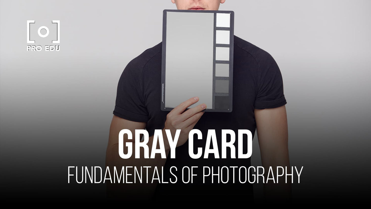
Use a grey or white card
When you want accuracy, place a neutral grey or white card in the scene and set the white balance off that. That ensures the camera knows exactly what white looks like.
When presets fail
Presets are great, but they assume standard lighting. Mixed lighting or creative scenes (e.g., sunset, interior with multiple light types) often demand custom white balance.
Step-by-Step: Setting White Balance Using a Grey Card
Here’s how I do it:
-
Place the grey/white card where the subject is going to be, facing the same light.
-
Fill the frame (or as large as you can) with the card and take a photo.
-
In your camera’s white balance menu, select “Custom” (or “Measure”) and choose that photo to set the white balance.
-
Replace the card with your subject and shoot. Your colours should now be true-to-life.
-
Always check your result on the camera’s display (preferably zoom into highlights/shadows) to confirm no odd colour cast remains.


Manual Kelvin Adjustment: For Creative Control
If you want to control the “look” of your image (not just neutral accuracy), work in Kelvin mode.
-
For a warm indoor scene (~3 000K) you might set 3 000-3 500 K.
-
For outdoor shade (~7 000 K) you might dial in around 6 500-7 000 K.
-
Want an ultra-warm golden glow? Lower the Kelvin slightly below the “neutral” and embrace the tone.
Essentially: lower Kelvin = warmer (more orange), higher Kelvin = cooler (more blue). Use this to match your mood or keep reality.
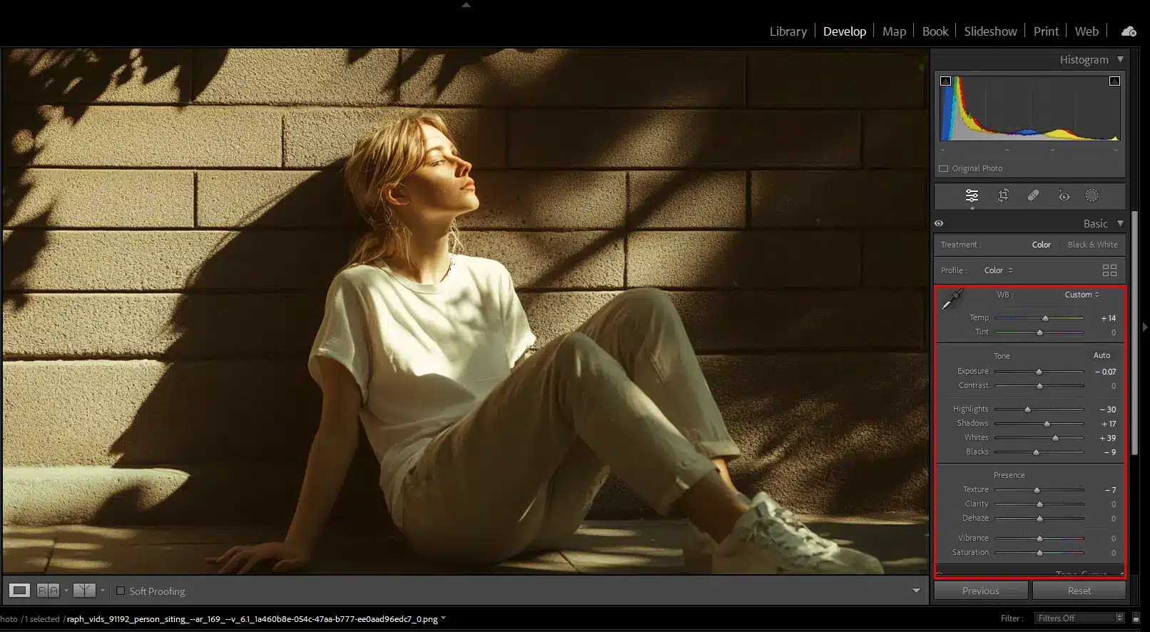
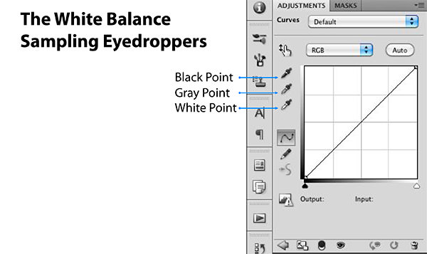
Correcting White Balance in Post-Processing
Even if your shot is nearly perfect, a little adjustment in post can refine colour.
-
Shoot in RAW — RAW files preserve white balance data and allow you to tweak later without loss.
-
In tools like Adobe Lightroom or Adobe Photoshop you’ll find a white balance slider (temperature/tint) or eyedropper tool. Use the eyedropper to click a neutral grey/white in your image.
-
Fine-tune: After user correction, you might tweak saturation or warmth to taste—but start with accurate white balance, then stylise if you wish.

Common White Balance Mistakes and How to Avoid Them
Mixed lighting pitfalls
When window light mixes with tungsten lamps, your camera may struggle to decide—which means colour casts can sneak in. In such cases, custom-white-balance is your friend.
Over-correcting colours
Aiming for “perfect white” is good—but sometimes slight casting is stylistic. Don’t revert to a bland look just because it’s “technically correct”.
Relying solely on AWB
Auto white balance is handy, but it can be fooled by dominant colours (bright red dress, blue ocean) or unusual lighting. Use AWB as a starting point, not the solution.
Practical Scenarios: Real-World Tips
Indoor tungsten lighting
Switch your preset to “Tungsten/Incandescent” or ~3 000 K manually. If you leave AWB, expect orange cast.
Overcast day outdoors
Cloudy light tends to be cooler/bluer. Choose the “Cloudy” or “Shade” preset (or ~6 000-7 000 K) to warm things up.
Sunset or golden hour
Here you might not want neutral colours—warmth is part of the mood. Set your white balance slightly lower Kelvin (~4 500-5 000 K) to retain that amber glow rather than neutralising it.
Flash photography
Flash light is often daylight balanced (~5 500 K). Use “Flash” WB preset, or match manually if using gels or mixed light.


White Balance & Style: When to Break the “Rules”
Yes—I’m telling you how to get accurate true-to-life colours, but I’m also nudging you: you don’t always need neutral colours.
-
If you’re going for mood, drama or stylised look, you might deliberately shift white balance for effect.
-
A cool blue look might enhance mood in a winter scene; a very warm tone might emphasise the heat of a desert or sunset.
Just be conscious: if you’re doing it intentionally, that’s great. If it’s accidental, you’ll know why the colours feel “off”.
Equipment and Tools to Help with Accurate White Balance
-
Grey/white cards and calibration targets: These give your camera (and later your software) a known neutral reference.
-
Color temperature meters or smartphone apps: These can help you measure ambient light colour temperature when you’re in more challenging lighting.
-
Monitor calibration: It doesn’t help to get your white balance perfect if you view/edit it on a monitor that’s mis-calibrated. Make sure your screen shows true colours.
-
Good workflow habits: Naming files, saving white balance presets for lights you use often, keeping notes. These habits save time and maintain consistency.
Workflow Tips for Consistent Colour Accuracy
-
Before shooting, set your white balance — don’t wait until after you’ve shot everything.
-
Check your results on the camera’s screen and if possible on a calibrated laptop/tablet. Zoom into white/grey areas.
-
Post-process in RAW with white balance correction → stylisation.
-
Archive your settings: If you find a setting that works well for your studio lights or favourite location, save it for next time.
-
Work end-to-end: Shooting, editing, displaying — all phases affect colour accuracy. If one link is weak (monitor, lighting, camera), your colours may still look off.
Frequently Asked Questions (Pre-Conclusion)
Q1: Can I fix a wrong white balance perfectly in post-processing?
Yes, in many cases you can correct a white balance shift when editing RAW files. However, severe or clipped colours may limit full recovery, and you’ll save time if you capture closer to correct in-camera.
Q2: Should I always use a custom white balance instead of AWB or presets?
Not always. Presets and AWB are fine for many everyday shots. Custom white balance is most useful when lighting is tricky (mixed sources), or when you demand colour accuracy (product, food, portraits).
Q3: Does white balance matter if I’m shooting in JPEG only?
Yes — even more so. JPEG files store the white balance setting baked in, so capturing the correct balance in-camera is critical. RAW gives more flexibility, but you still benefit from getting it right to start with.
Q4: What Kelvin value should I choose for a sunset shot?
It depends on the mood you want. A neutral sunset might be ~5 000–5 500 K, but if you’d like a warmer glow you might choose ~4 500 K or even lower. Experiment and check your result.
Q5: Does monitor calibration really affect white balance accuracy?
Absolutely. If your monitor is too warm or cool, what you see when editing may mis-lead you. Calibrating your screen ensures what you see is what your viewers will see, so your white balance corrections are meaningful.
>>> Photo editing software CLICK HERE <<<
Conclusion
When I first started shooting, I often ignored white balance — and paid the price with photos that looked “off”. Over time I learnt that mastering white balance is like tuning the foundation of your images: once you get white right, everything else falls into place. Whether you’re photographing people, products, landscapes or street scenes — accurate white balance means your colours feel real, your tones remain true, and your work looks consistently professional. So next time you’re about to hit the shutter: glance at your lighting, choose or set your white balance deliberately, and shoot with confidence. Your images will thank you.
Further photo tips here:
Mirrorless vs DSLR: Right Choice for Your Photography Needs?