Best Lightroom Editing Tips for Natural-Looking Photos
When I first opened up Adobe Lightroom and started diving into slider after slider, I realised fairly quickly that natural-looking edits are harder than dramatic ones. We all love bold, eye-catching visuals, but as I learned (sometimes the hard way) those overly-processed images often feel fake, or worse—they distract from the story the photo is trying to tell. In this article I’ll walk you through how I edit so that my photos look real, not overly edited, as I share my top tips for discovering easy Lightroom edits for photos that look real, not over-processed.
Why Natural-Looking Edits Win
We live in a world flooded with Instagram-perfect images, so when a photo comes along that looks credible, it stands out. A naturally edited photo feels like a moment captured rather than a filter applied.
When viewers sense authenticity, they engage more deeply. Want your work to age well? Avoid trends that scream “2018 filter”.
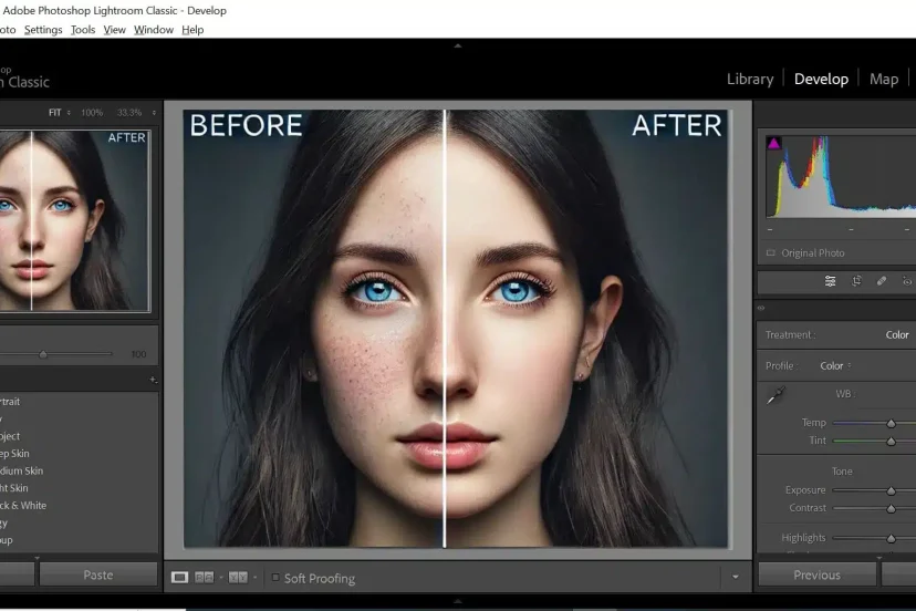
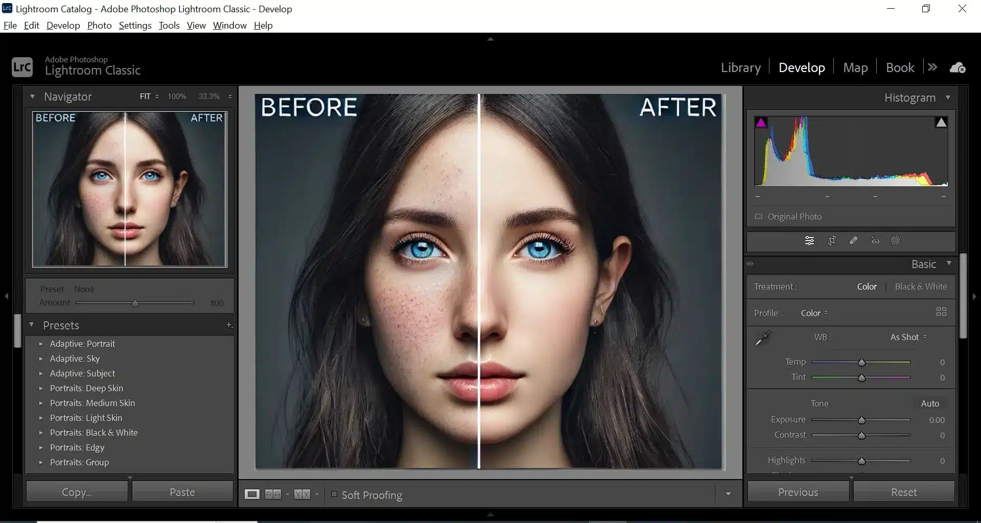
What “Over-Processed” Means
Over-processed often shows up as ultra-vivid colours that bleed, halos around edges from aggressive clarity, skin tones that shift weirdly, or skies that look cartoonish. Think: “Did someone just paint over this?” instead of “Wow, the light is amazing”. These are the traps I’ve fallen into—and they teach you the value of restraint.
Getting Started – Your Workflow
Good editing starts before you hit the Develop module. It starts with your workflow.
Shoot with Editing in Mind
If you capture a raw file with blown highlights, weird white balance or poor exposure, you’re already fighting an uphill battle. Aim for well-exposed, well-coloured files. Have you ever tried to pull detail out of pure white? Trust me, it’s frustrating.
By the way: raw files give you far more flexibility for those subtle edits.
Import & Cull Efficiently
When I import into Lightroom I immediately flag or rate the keepers, reject the duds, and apply basic keywords. It saves hours later. A clean slate means you can focus on editing rather than sorting.
And here’s a bonus: before editing a batch, ask yourself: “Do all these photos need identical treatment?” Often, no—they don’t. That’s good.
>>> Get LIGHTROOM Click HERE <<<
Basic Develop Module Adjustments
Now the fun begins. These settings are the foundation for keeping things real.
Exposure, Contrast & White Balance
Start with exposure. If the overall scene feels too dark or bright, fix that first. Then adjust contrast—but be gentle. Real light doesn’t hit with “boom” every time.
White balance matters a lot. I often switch between “Auto”, “Daylight” and “Cloudy” as a base, then fine-tune the Temp and Tint sliders. If skin tones are off or foliage looks odd, your look is shot.
Highlights, Shadows, Whites & Blacks
Here you’re retaining detail. Pull down highlights to recover bright areas; raise shadows to show details in dark corners—but don’t flatten everything. We still want depth.
For whites and blacks: hold the Alt/Option key while dragging to see clipping. That helps you keep things within range.
Clarity, Texture & Dehaze
These are powerful—but dangerous in the wrong hands. Clarity and Texture accentuate micro-contrast: good for detail, bad for halos or fake looks. Dehaze is great when used subtly—especially for landscape, but over-do it and you create a heavy atmosphere.
As a rule: check “before/after” often. If you can’t tell whether you moved the slider at all, you’re probably fine.

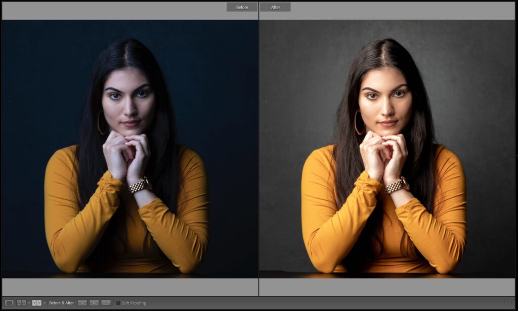

Colour & Tone Adjustments
After the base, we move to colour, and this is where many photos go off the rails—so I’ll guide you to keep it grounded.
Vibrance vs Saturation
Saturation increases all colours equally—dangerous if you have one strong hue (like a red jacket). Vibrance boosts the less saturated colours more, preserving skin tones and overall balance.
I often raise Vibrance a bit (+10-20) and leave Saturation at zero, then tweak selectively.
HSL/Colour Panel – Targeted Tweaks
Here you can go ninja: want the greens in the background to calm down? Drag the green Hue or Luminance sliders. Want skin tones consistent? Tweak the oranges.
But remember: small adjustments. I often ask: “Would this scene appear like this if I was standing there?” If the answer’s no, dial it back.
Local Adjustments and Masking
Global edits are great—but the secret to realism is subtle local tweaks that feel invisible.
Brush, Graduated Filter & Radial Filter
Use the Graduated Filter to gently darken skies, the Radial Filter to highlight faces, and the Brush to clean up distractions or brighten eyes.
For example: I’ll brush a little exposure +10 on a subject’s face, maybe reduce Temp -3 if skin got too warm from global WB. Other than that, I leave it alone.
Avoiding Over-Sharpening & Noise
Sharpening is essential, but oversharpen and you’ll see halos; neglect and you’ll get mush. I typically set Sharpening to ~40–50, Radius ~1.0, Masking ~60 (which protects flat areas).
Noise reduction: I flip to 100% zoom and inspect shadow areas. If there’s grain and you want clean print or web use, increase Luminance to ~10-20 and detail ~50. If the image is full of detail (leaves, hair), stay lighter.


Export & Output – Keeping It Real
You finished editing—it looks great on your screen—but will it look great everywhere else? This matters.
Sharpening for Output
When you export, choose output sharpening. For web: Standard, JPEG, sRGB, 72 ppi often works. For print: High, JPEG/TIFF, sRGB or AdobeRGB, 300 ppi.
Remember: too much sharpening for web means extra noise or haloing when image loads large.
Colour Profile & Format
Most web platforms assume sRGB. If you export in AdobeRGB and upload without conversion, your colours appear dull. Always use sRGB for web. For print, AdobeRGB is fine if your print lab supports it.
File format: JPEG is fine for general use. If you’re archiving or doing high-end print, export a TIFF at max quality and 16-bit depth.
My Personal Rules for Keeping It Natural
Here are habits I’ve adopted (and you can too) to stay grounded.
Less is Often More
I ask myself: “If I reduce this edit by half, would the photo still look good?” If yes, I’ve probably done too much.
The trick: aim for the viewer not to say “Wow, the editing!”, but to say “Wow, the photo!”
Consistency Across a Series
If I shoot a series (wedding, travel, family), I aim for consistent colour and tone. That means I’ll create a base preset (light adjustments) and apply to all, then tailor each image individually.
Consistency builds a professional look and strengthens your style.
Common Mistakes & How to Avoid Them
We’ve covered what to do. Now, what to not do.
-
Over-saturation: My friend once increased Saturation +100. The result? Neon skin and blue-green trees. Instead: modest tweaks.
-
Ignoring white balance: Warm sunset light? Don’t neutralise it unless you want daytime look.
-
Heavy dehaze/clarity: Over-done and you get weird contrast, halos around edges.
-
Export mismatch: Using ProPhotoRGB or AdobeRGB and uploading to web—colours go wrong.
-
Too many presets: Slap preset after preset and you lose your original scene. I use presets as starting points, not finishing points.
Conclusion
Editing with Adobe Lightroom needn’t feel like applying heavy filters or chasing artificial trends. When you focus on light, colour, subtlety—and ask yourself “Does this look real?”—you’ll consistently produce images that feel genuine, timeless, and engaging.
Apply these easy editing tips, and you’ll discover easy Lightroom edits for photos that look real, not over-processed. Your photos will thank you—and so will your viewers.
>>> TODAY’s camera deals click HERE <<<
FAQs
Q1: Can I edit JPEGs instead of RAW and still keep it natural-looking?
A1: Yes—you can. But editing RAW gives you more latitude (colour, exposure, highlight recovery) which helps when you’re aiming for subtlety. JPEG puts more limits on how far you can go without quality loss.
Q2: How much clarity is too much?
A2: I treat clarity like salt in cooking—just a pinch. If you increase clarity and instantly see harsh lines or halo effects, you’ve gone too far. Try +10-15 max for many images.
Q3: Should I always use presets for consistency?
A3: Presets are great as a starting point, not the full stop. By all means create a base preset for your style, but tweak each image individually so it keeps its unique character and natural feel.
Q4: What’s the best export resolution for web?
A4: Generally a long edge of 2048 px (or similar), JPEG quality ~80-85, sRGB profile. That balances sharpness and file size nicely. For Instagram or similar, you might go a little smaller.
Q5: How do I know when it’s time to stop editing?
A5: Final check: zoom in to 100%, step away for 10 minutes, then look again. If you still think “This looks natural, nice light” rather than “Wow, what was done here?” you’re good. If you notice artifacts, weird tones or over-boosted colour—undo some sliders.
Further photo tips here:
Golden Hour Photography: Mastering Nature’s Most Magical Light