Color Grading in Photography: How to Set the Mood of Your Image
Learn creative color grading to enhance emotion and visual tone.
When I first started working with digital photography, I quickly discovered something: two photos with identical compositions can feel completely different just by shifting the colors. That’s the power of color grading. It’s not just about making a photo look “better”—it’s about giving it emotional intention. In this guide, I’ll walk you through how I approach color grading so you can confidently shape the mood of your own images.
What Is Color Grading in Photography?
Color grading is the process of artistically altering colors to create a specific mood, emotion, or style.

The Difference Between Color Correction & Color Grading
Before you grade, you must correct.
-
Color Correction ensures your image is accurate.
-
Color Grading adds a creative layer after accuracy is achieved.
I always think of correction as tuning the instrument and grading as playing music.
Why Color Grading Matters
Color is emotional—whether you intend it or not.
How Color Influences Emotion
Warm oranges may evoke comfort or nostalgia. Cool blues often feel calm or mysterious. Greens can feel natural or cinematic.
The Psychology Behind Color Choices
Here’s how viewers typically react to certain tones:
| Color Tone | Emotion Created |
|---|---|
| Warm/Golden | Happiness, nostalgia |
| Cool/Blue | Calm, isolation, tranquility |
| Green | Nature, balance |
| Teal/Orange | Stylized cinematic feel |
| Desaturated Tones | Drama, moodiness |
Understanding these associations helps you grade with purpose.
Essential Tools for Color Grading
There are many tools available, but Lightroom and Photoshop remain the most accessible.
Using Lightroom for Color Grading
Lightroom gives you a simple but powerful set of tools.
HSL Panel
Adjust Hue, Saturation, and Luminance for precise color refinement.
Color Grading Wheels
These wheels give you control over Shadows, Midtones, and Highlights, letting you craft subtle or dramatic moods.


Using Photoshop for Advanced Grading
For deeper control, Photoshop excels.
Gradient Maps
A gradient map remaps the tones of your image—perfect for film-like or cinematic grading.
Selective Color
This tool lets you shift individual color channels with precise accuracy.
Foundational Color Grading Techniques
These are the tools I rely on for almost every image.
Adjusting White Balance for Mood
White balance doesn’t just fix color—it sets tone.
-
Warmer WB = romantic, inviting
-
Cooler WB = dramatic, crisp, moody
A simple WB adjustment can transform the atmosphere instantly.
Using Contrast & Tone Curves
Tone curves let you add richness, deepen shadows, and create contrast that complements your grade.
Split Toning to Add Emotion
Split toning allows you to add one tone to the shadows and another to the highlights.
Want a dreamy summer feel? Add warm highlights and soft teal shadows.
Want a cinematic look? Try teal shadows and orange skin tones.

Popular Color Grading Styles (and How to Create Them)
These are styles I use regularly, each with its own emotional outcome.
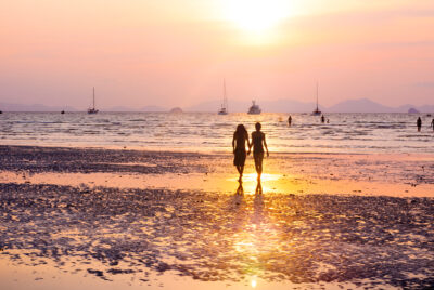
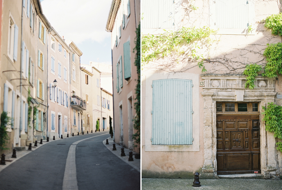
Warm & Golden Tones
Great for sunsets, joyful portraits, or travel imagery.
To create it:
-
Warm the white balance
-
Add golden tones to highlights
-
Slightly desaturate cool colors
Moody Teal & Orange Look
This style screams “cinematic.”
It enhances skin tones while making backgrounds cool and dramatic.
Soft Pastel Film Look
Perfect for dreamy travel photos or portraits with gentle vibes.
Settings I use:
-
Lift shadows
-
Lower contrast
-
Desaturate blues and greens
-
Add mild pink/peach tones

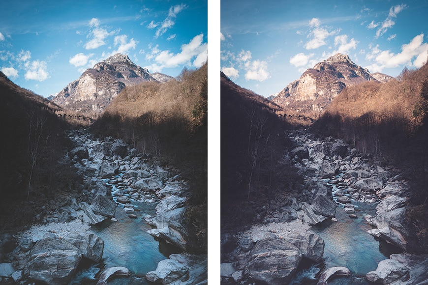
High-Contrast Dramatic Style
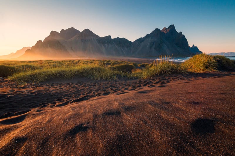
This is ideal for mountain landscapes or darker, moody scenes.
Increase overall contrast, add coolness to shadows, and push clarity for texture.
How to Match Color Grading to Your Scene
Your grading should complement—not contradict—the subject.
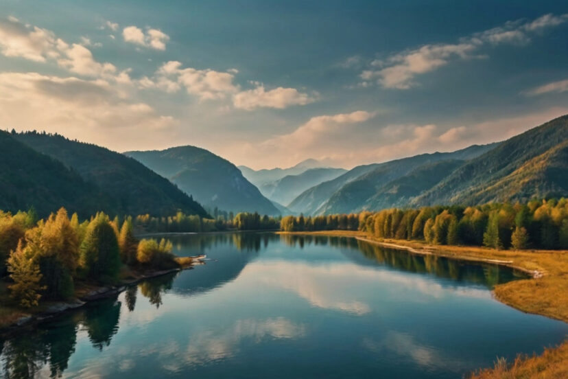
Landscapes
Cool tones can bring out drama in mountain scenes, while warmer tones enhance desert and sunset photos.
Portraits
Skin tones matter.
I always avoid overly green or blue skin tones—unless the style demands it.
Travel & Street Photography
Urban shots often benefit from punchy contrast and stylized colors, while cultural photos often shine with warm, authentic tones.

Step-by-Step Workflow: My Personal Color Grading Process
Import to Export Workflow
Here’s my typical approach:
-
Correct exposure and white balance
-
Fix lens distortions
-
Adjust HSL for harmony
-
Apply split toning
-
Fine-tune shadows/highlights
-
Add a slight vignette if needed
-
Compare before/after
-
Export for print or social media
This workflow keeps my style consistent and intentional.
Common Mistakes to Avoid
Color grading is powerful—but easy to overdo.
Over-Grading
If your viewer notices the grade more than the photo, you’ve gone too far.
Ignoring Skin Tones
Skin should always feel natural unless you’re creating a very stylized look.
Inconsistent Style
If you want a cohesive portfolio, keep your grading style consistent across your work.
Conclusion
Color grading is more than a technical step—it’s an artistic expression. Once you learn creative color grading to enhance emotion and visual tone, you gain the ability to tell deeper, more powerful stories with your images. Whether you’re going for cinematic drama, warm nostalgia, or soft pastel vibes, your color choices guide your viewer’s feelings.
Experiment boldly, review your results often, and most of all—enjoy the creative freedom grading gives you.
FAQs
1. What’s the best software for beginners learning color grading?
Lightroom is the easiest and most intuitive place to start.
2. Should I color grade before or after correcting exposure?
Always correct exposure and white balance first.
3. How do I avoid making colors look unnatural?
Make small adjustments and frequently toggle before/after previews.
4. Can color grading fix bad lighting?
It helps, but it can’t replace high-quality lighting and composition.
5. Should I use presets for color grading?
Presets are great starting points—but always customize them to your image.
Further photo tips here:
https://phototipsgalore.com/perfecting-white-balance-get-true-to-life-colors-in-every-shot/ https://phototipsgalore.com/golden-hour-photography/ https://phototipsgalore.com/portrait-photography/ https://phototipsgalore.com/contrasting-photography/ https://phototipsgalore.com/best-lightroom-editing-tips-for-natural-looking-photos/